💡 During a quarterly planning meeting, it caught my attention that there were two items to redesign two of the three existing category pages on ecobee.com, yet, all of the category pages had an inconsistent design! Should you dedicate resources to it? or do you revisit your strategy first? Strategy comes first, so I took it upon myself to research best practices and compare against other websites; I documented and communicated to the team leadership the findings and kickstarted the strategy workshop (which was paused due to new relevant data expected to become available with the release of the navigation menu redesign).
Overview
Depending on who you ask, there will be different categories identified for the products and services provided by ecobee. I will explain some of them but, before that, I'd like to give you a question to keep in mind: should a Smart (indoor) Camera and a Smart Doorbell Camera belong in the same category, let's say a "Camera" category? I'd love for you to reach out and let me know! This topic has caused polemic 😁
One quick note, you will see the term "visitor" instead of user. The reason why we called it a visitor was to distinguish it from ecobee's app and device users; so a visitor refers to someone who visited ecobee.com regardless of whether they are an ecobee app or ecobee device user.
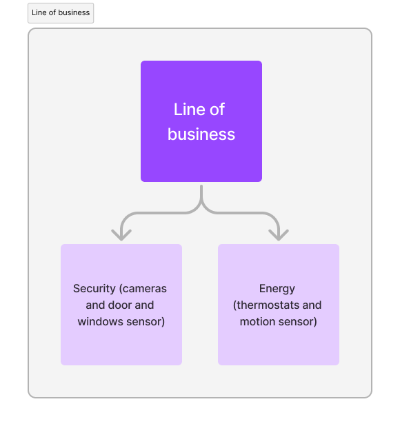
Line of business
The services and devices for consumers at ecobee are classified as:
Energy, which includes all thermostats and motion & occupancy sensors
Security, which includes cameras, door &windows sensor, and smart security subscription
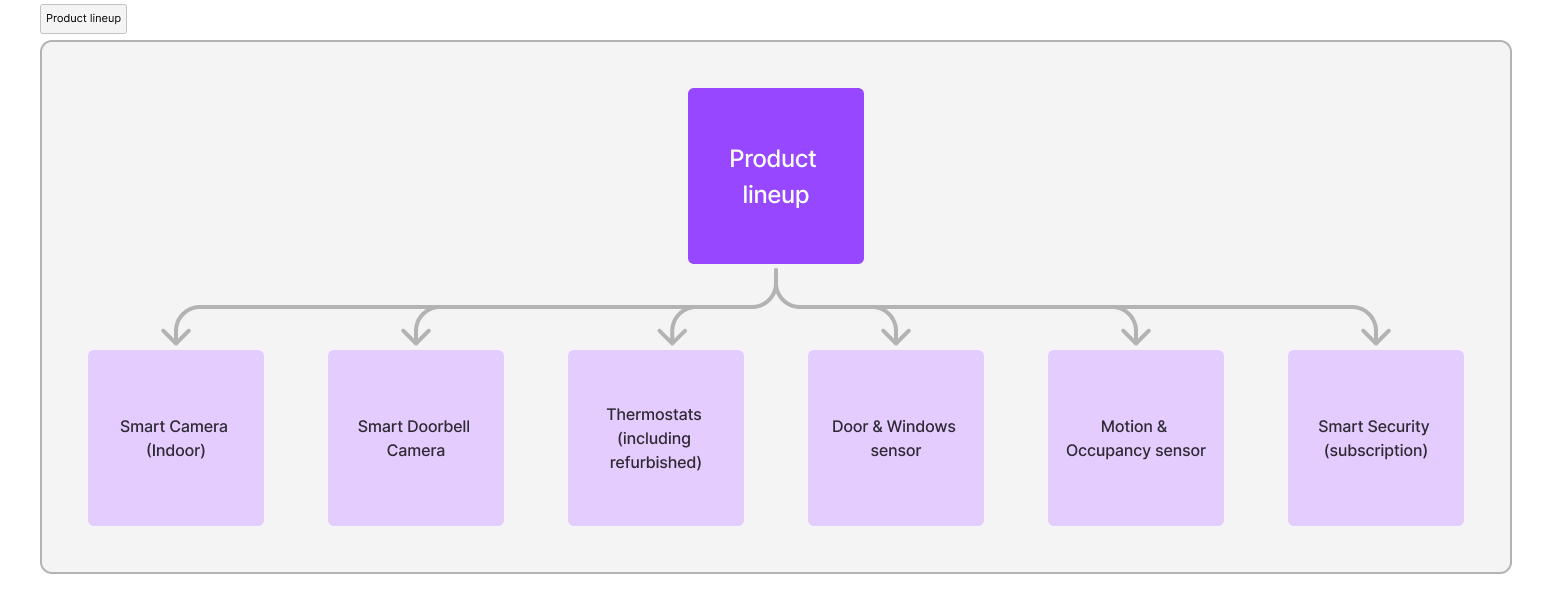
Product/Service line up
The available devices and subscriptions for consumers can be categorized as follows:
Smart (Indoor) Camera
Smart Doorbell Camera
Thermostats, including refurbished
Door & Windows sensor
Motion & Occupancy sensor
Smart Security subscription
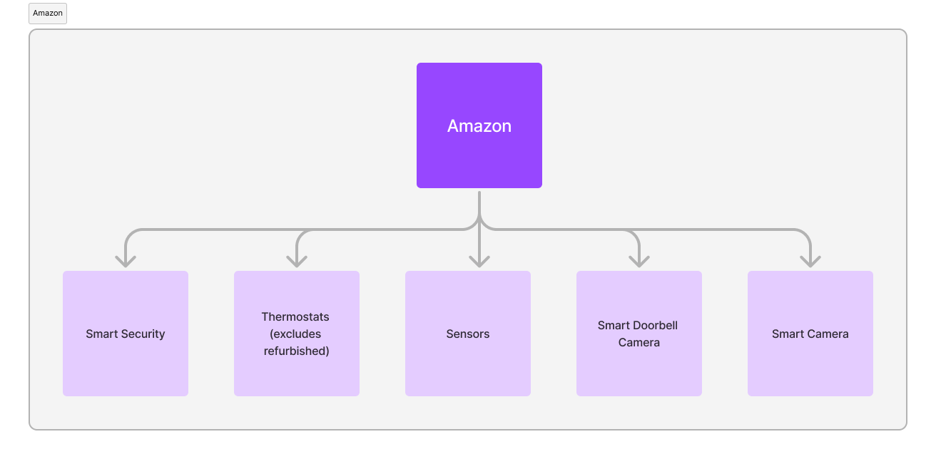
ecobee offerings available on Amazon
Based on the tabs available on amazon for ecobee's shop, these are the categories available:
Smart Security subscription (information only, it can't be purchased on Amazon during the time I worked at ecobee)
Thermostats (excluding refurbished)
Sensors
Smart Doorbell Camera
Smart Camera (refers to the indoor camera)
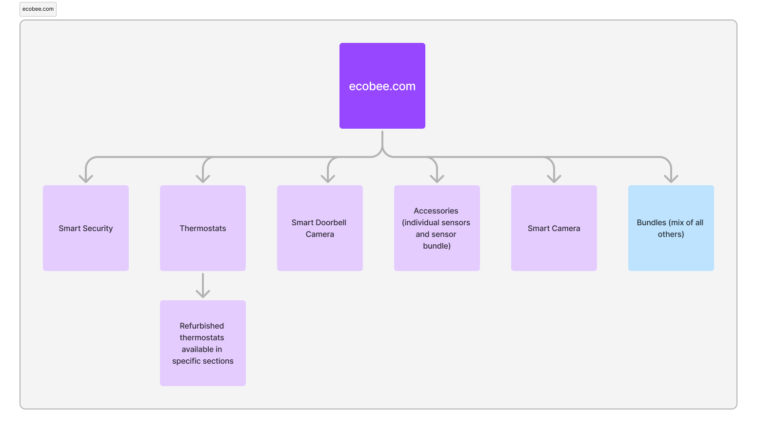
Categories on ecobee.com
These are the categories of products and services on ecobee.com:
Smart Security subscription (during my time at ecobee, this was not available for individual purchase)
Thermostats (including the ecobee.com exclusive of refurbished thermostats, though not available for purchase in the thermostat category page)
Smart Doorbell Camera
Accessories (referring to the two type of sensors and a bundle including the two sensors)
Smart Camera (indoor)
Bundles, which is an ecobee.com exclusive offering and its a mix of all other products and services
👀 So what should be the categories on ecobee.com and why?
ecobee.com category pages
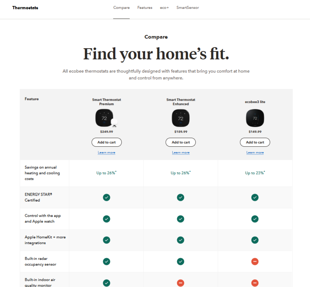
The thermostat category page is the most used by visitors as most are interested in ecobee's thermostats; by reviewing the heat map of the page though, we know that visitors are mostly interested in the comparison chart and less than 30% will view the content below this chart. This poses the question of, is the goal of this category page to help users identify the best thermostat for their needs?
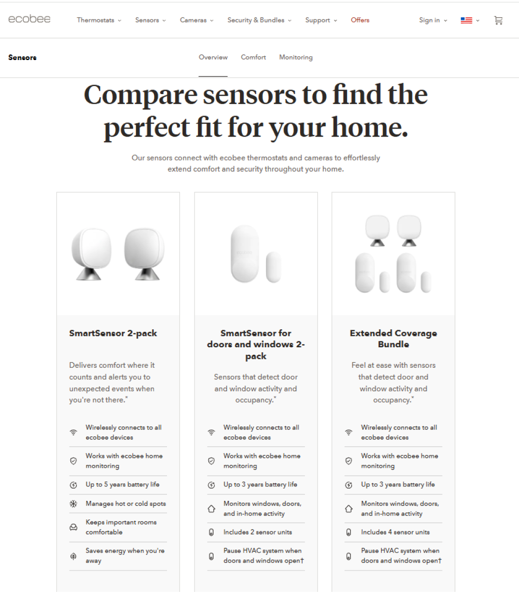
The accessories category page uses the title "Compare sensors" but there are only two sensors, each with their very unique features for different user needs, and a bundle that features the two sensors with an extra savings. So while it visually looks like a comparison chart, it is not to be used as one.
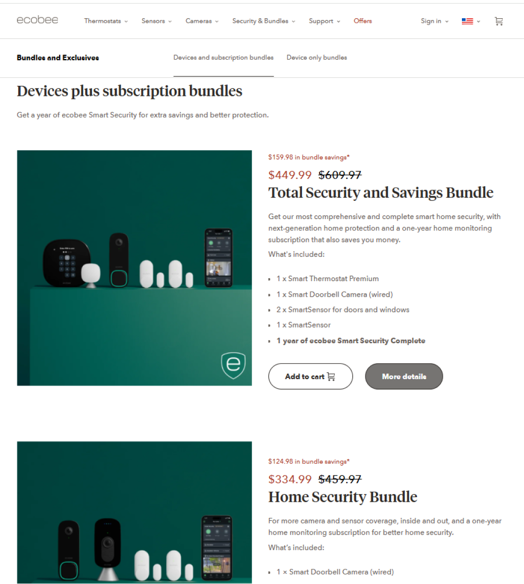
Finally, the bundles category page is simply a list of each of the available bundles featuring the name, short description and what's included in the bundle. There isn't a way to filter or easily compare the different options.
Remember I mentioned that there is a Smart (Indoor) Camera and a Smart Doorbell Camera and no "Cameras" category? If you have made up your mind of what you think of this, reach out and let me know! I'd love to hear your perspective on it 🤓
Summary of findings
Inconsistency of the format and information presented in each of the category pages. Alignment on goal for category pages needs to be defined
According to research, category pages are recommended for listings that contain over 25 products, which ecobee did not have. However, two questions arise:
ecobee visitors interact with breadcrumbs to return to the category pages and continue with their product research; how would this experience look like without category pages?
According to the market research, some websites had category pages only for those that had 25 products or over and did not offer category pages for the others. Does this create inconsistency on the visitors navigation expectations?
According to guidelines and comparing with ecobee's products offered in Amazon and Home Depot, ecobee's website is lacking product subtitles that highlights some of the features; this requirement would be even more relevant if category pages were removed
Based on the available data at the time, hypothesis is that web visitors interact with category pages because the navigation menu doesn't allow a visitor to go straight to a product page so, effectively, the visitor has no choice. A redesign of the navigation taxonomy was expected to provide better insights into the role that category pages play in the user journey so I strongly recommended to wait for that data to inform the strategy and the team leadership was in agreement with the proposal
Guidelines as per Baymard Institute
A table was created with three columns: the guideline title, where only the most relevant were selected; the score in a scale ranging from 0 meaning no adherence to 4 meaning very high adherence, no changes recommended; and notes where a short description of the guideline was included within the context of ecobee's category pages. The guidelines evaluated were:
Entry points to category pages
Avoid using intermediate category pages for sites with a small catalog (fewer than 25 products)
Product lists highlighting top features
Facilitate comparison between products
Bundles classification (should bundles have their own category page? for example, if a bundle includes a thermostat, should this bundle be features in the thermostat category page as well in the same way that the sensors bundle is included in the accessories category page?)
Comparison against other websites
Based on the guidelines researched, I went out to compare it against other websites including the website URL, why it was selected and screenshots. The websites selected for comparison were:
Google, as a competitor. Category pages (multiple levels) are used in Google as a way to narrow down the search based on the needs. Every top level category page (available in global nav), contains either further category pages or filtering of several product results. Due to the number of options and variety of product types, having these category pages would enable the user to find easily what they are looking for. This adheres to Baymard’s guideline of category pages for over 25 products.
Sonos, as a website that ecobee draws inspiration from. Sonos has multiple products within each category; a category page helps the user narrow it down to the type of speaker they are looking for; additionally, they offer the ability to check products to compare specifications. This adheres to Baymard’s guideline of category pages for over 25 products.
Peloton, similar product lineup structure. Peloton does not have category pages for categories where the products available within the category are less than 25: They have two types of bikes (similar to how we have options for Tstats) and they have other products types that have only one product within that category such as ‘Row’. These two have no category pages. Accessories does have a category page but it is 26 items available and offers filters to narrow it down to what the ‘hub’ each item is compatible with.
Arlo, as a competitor. Arlo has a global navigation where the category page is not the highlight unless the user clicks on “Shop & Compare” which states that one of the purposes of the category page is to compare the multiple products within it but, the choices in the global navigation, highlight the product with a short description, price and image and the category page is an additional help but not where they intend to take the users through. Even though they only have one floodlight option, they did create a very short category page for it, accessible via the footer. The accessories category page has filters and 48 items.
Vivnt, as a competitor. Global navigation uses the category as the navigation link title but only provides the access to the PDPs. Their pages are very content heavy and overwhelming so I am not 100% sure but I believe they do not have category pages.
Available data
Let's just start by saying that data is amazing but it is mostly directional and has to be interpreted within the context. As mentioned before, the navigation menu, at the time, did not provide an entry point to the product detail pages which meant that the visitor had no option (other than drop off) than to go through the category page. Additionally, some visitors from paid media start their journey in a product category page and the journey and stage in the purchase funnel will be much different than someone who came to the home page via a google search. So, what did we know? These are just a few data points:
29.3% of all visitors (regardless of how they came to the website), viewed a product details page
13.1% viewed a category page
An active visitor, which represents only 4% of all sessions but contribute to >50% of channel's sales, will visit one or more product detail pages and one or more category pages within a session (reach out to me if you'd like me to share my process for defining active visitors!)
A higher percentage of visitors were navigating from the category page to the product page whereas only a low percentage was navigating from the product details page to the category page. This to me indicates that visitors use the category page because the website provided no other means of navigation to the product page and the sample of session recordings seemed to confirm it but, until there is a test and/or the navigation taxonomy changes are released, I would consider this evidence inconclusive
Conclusion
While I am no longer at ecobee to continue developing the strategy, I believe my contribution saved time and money by preventing the redesign of pages without a strategy and objective in mind. My research, documentation and workshops, as well as my communication skills, have shifted the mindset of the team's leadership on approaching changes informed on UX and data and provided a solid foundation for the team to continue on with the next steps.